
Bits and bobbles
Some weeks can be super busy, yet not have a lot to post about. This has been one of those weeks. I spent daaaaays getting videos ready for a zoom class on Modern Fills that I taught last Saturday to the Guild of Quilters of Contra Costa County. The class was absolutely fabulous with lots of interaction and questions, so it was well worth the work.
When I teach online, I rarely demo live. Why? Wellll, thread breaks, bobbins run out, things misbehave for no known reason, bobbins barf, and scissors go to the other side of the moon. I don’t want my students to suffer through that. When I make videos, they have clear sound, a clear view right in front of the needle, and I can cut out any problems. Also, once I have established the path for the design I am quilting, I will double time my quilting so that my students can see a lot more quilting and understand the decisions I’ve made. It’s a win-win.
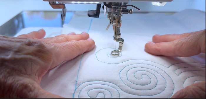
BUT, my video editing software was not doing what I wanted it to. I knew it was most likely operator error, but I couldn’t figure it out despite a zillion YouTubes and searches. I stumbled my way through and ultimately figured it out. In the meantime, my computer was doing odd things too. It was quite the week.
I am also taking Donalee Kennedy‘s “See Like An Artist” live online class that meets twice a week for 3 weeks. I have so much to learn! This week I learned some interesting things. There is a concept that you’ve seen but maybe didn’t know there was a name for it – “flat and glow”, meaning, there are 2 pieces of fabric close in value, but one is very saturated and the other flat. I was intrigued by that concept! For my assignment this week, I chose to do some improv piecing and try to achieve flat and glow.
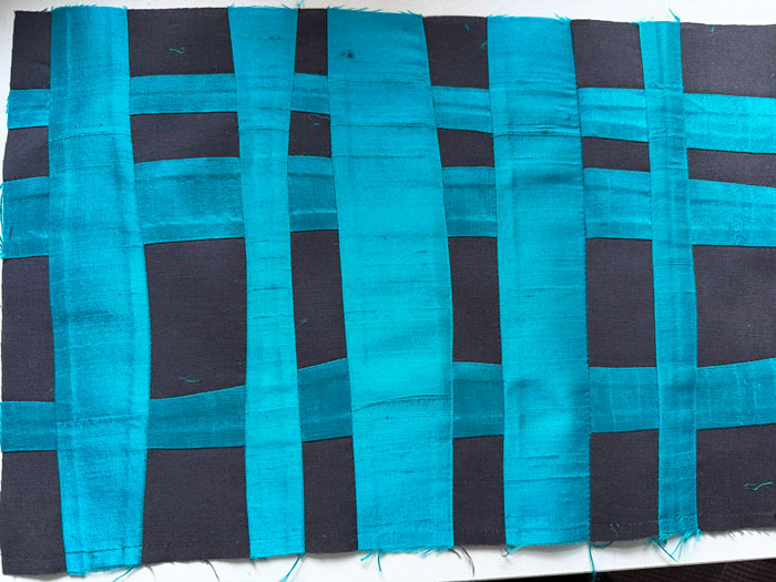
The turquoise is silk dupioni and the charcoal is Kona cotton. There appears to be a definitive contrast.
When I put it into Photoshop and reduced it to black and white, I got this:
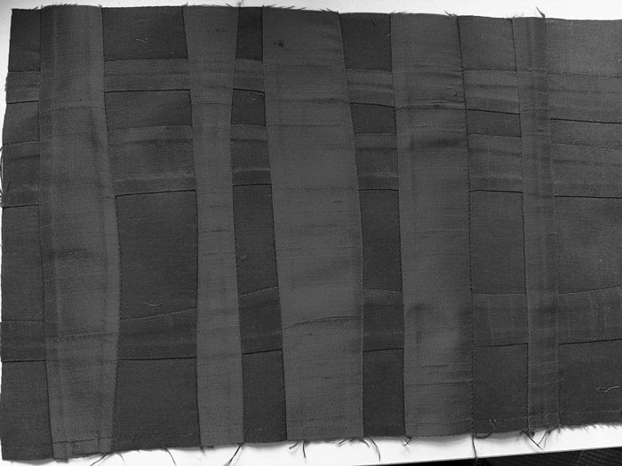
I was shocked! Maybe those of you who are experienced with color anticipated this, but I did not. I do routinely take my work and look through the red filter thingy to make sure my values are good. But I’ve never experienced this. This is why I am in class.
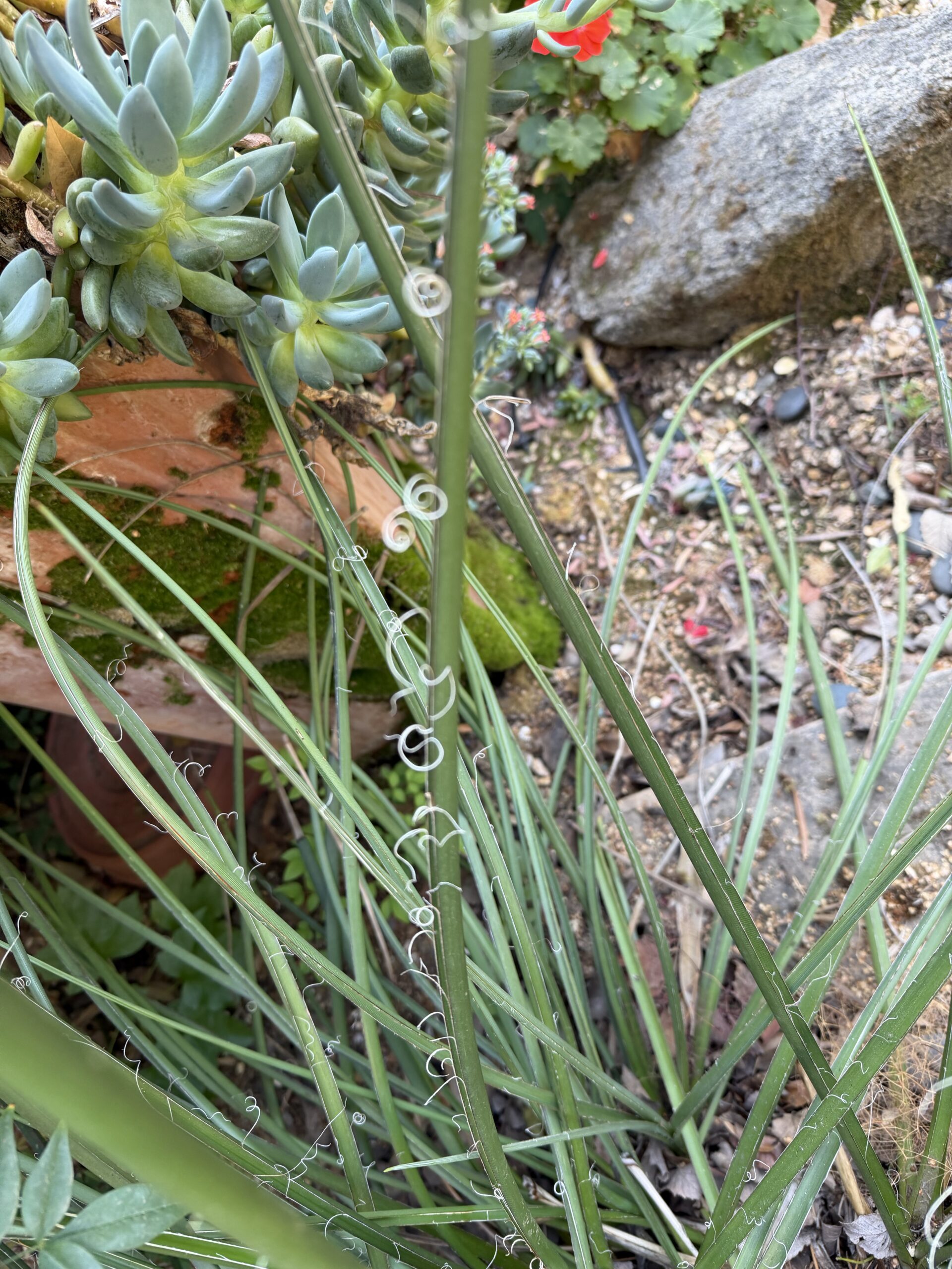
We are to do small little compositions for each class, taking one each of a Principal of Design and one Element of Design. I had fun with this – Line + Contrast. My inspiration was my Yucca plant beginning its fall thing:
I did this 4″ x 6″ piece on black construction with white chalk quilting pencil:
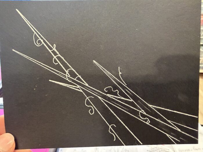
That was fun; I enjoyed the composition and especially the contrast in value and line. This gets me out of my box and working in new ways, learning new things.
I’ll be linking up:
Nina Marie’s Off the Wall Friday!
